Each of these covers are different but effective in there own way.
For the Michael CD cover it is effective because the cover shows a range of album covers which he had done before, this shows what could be in the album- a collaboration of his old and new music.
This album is effective because it is simple portrait but with the light bold font upon the dark background makes it eye catching.
This cover maybe quite artistic with a theme to it. I think it shows the group 'take that' growing though there career and the album's name 'progress' seems to represent the same theme of growth. This is therefore eye catching and wanted buy their fans.
This is effective because she uses the album as a tool and by that i mean- she releases it at christmas time and 'the gift' for the name of her album is very ironic but persuasive.
Wednesday, 15 December 2010
Design - front cover
This is the front cover of my album dreams.
I took his photograph myself and chosen a fancy type of text from 'www.dafont.com' to use for the title.
I took his photograph myself and chosen a fancy type of text from 'www.dafont.com' to use for the title.
Wednesday, 24 November 2010
Research- fonts
Wednesday, 17 November 2010
Research- printing templates.
These are a few printable templates that i could use for my album. I could use the internet to print out the template which would not have my design on the cover.
For this one i can download the template then place my design on the template which i can then print off myself, which would be able to save me money.
These two are the template designs that i do like, which they are both simple but look good for the album.
This is very similar to what I want my album cover to look like if it goes to plan.
Action plan - the next four weeks.
Week One- I should be researching printing companies for preparation of the finished album cover design. Keeping in mind the images i have already taken for the cover and go into the studio to take portraits pictures which could be used.
Week Two- I should know how i am to print my design. Use the portrait photos to experiment in the darkroom which i could use the cover.
Week Three- I should be creating the template for the whole album such as; front cover, case, listing and inside information. This should be finished by the end of the day.
Week Four- I should be printing out the whole album which should be completed.
Wednesday, 10 November 2010
My photographs- poster ideas
All of these images that i took have a theme of stick men and what they can use. These photos i want to use to make my own poster about a band using the stick men. I thought this was a good idea as it will be bold and can let the viewers pick their own interpretations of what the band could be like.


These two images i thought that i could use them to put as information on the poster. For example 'dreams' could be the name of the band or the title of the album. 'At any time' could be the time of opening, the name of the band or title of the album.

These two photographs i thought would be good for the background of the poster which i could put together to get a better image. This would be an interesting background and i think it will look good together or on their own .


These two images i thought that i could use them to put as information on the poster. For example 'dreams' could be the name of the band or the title of the album. 'At any time' could be the time of opening, the name of the band or title of the album.

These two photographs i thought would be good for the background of the poster which i could put together to get a better image. This would be an interesting background and i think it will look good together or on their own .
Research- posters and flyers.
All of these posters show a graphic way to advertise their bands or acts. Each one is very colourful which allows them to been seen by passers by. This then helps to beat competition be colourful as it will make the viewers look at theirs and not their competitors.
 The posters show a decent amount of text, which gives the readers basic information about the band/acts such as; name, date of release, price, where it is to be released. The little amount of text then does not let the readers turn away whereas if the poster is over loaded with information it would get a worse reaction and not be viewed.
 Wednesday, 3 November 2010
My photographs- possible album covers.

In this photo shoot i went to different locations around Burton whilst thinking about possible album covers which could symbolise a band.
This photograph i used in photoshop to give the photo a different look, in black and white, to show examples of what it could be, the photograph has been cropped to give a square shape. I do like the image better after it has been edited.

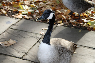
This photograph i used the bird as the subject which is in focus and the background is slightly blurred which i was trying to give a different view to the way the band could look on the album cover. I also love the colours given by the leaves with the contrasting black and grey bird.
For these two images i like the colour and the shadows of the trees i thought of the band's shadows in replace of the trees. This would then show the band in a creative way.
For these images i liked the idea that the subjects in the band cold be standing in the gaps in the tree to show a creative effect. I also like the organic background with no man-made materials showing. I also like the angles of the third photo it looks like the buyers look-up to the band.
I like this photograph because of the shadowed bench with the light shining on bench with the geese slightly been shown through the gaps. This could be used for an album cover and a member could sit on the bench or be standing in the background shown through the gaps instead of the flock.
These images of the faces could be an album because it would give the band an abstract or creative way giving a unusual look about them.
Subscribe to:
Comments (Atom)


