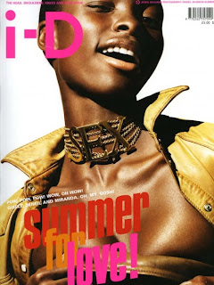
these are a few selected i-d magazine covers. each of the different covers have each got similar qualities. by this i mean the logo i - D is always on the left hand corner, the model always has to close or cover up the left eye, the model is mostly shown from the top of the head to just below the shoulders , also, the catch phrase or slogan is always below the i-d logo. also, the magazines covers are mostly a women and hardly ever a man.
i have chosen to look the covers so the group can compare the i-d magazine with the one the group is going to produce. by doing this the group can see how to produce the magazine cover to see the advantages and disadvantages of making and selling the i-d magazine. the basic advantages for making the i-d magazine cover are; bold colours that stand out, the logo and the wink has to be there, the model has to be standing out and maybe using props to make them different from the rest of the magazines.
there are a few larger images for the i-d magazine covers. i have made them bigger because they are the few that i think are the better one's. i like these more because they are different or more standing out to the crowd. the first cover with the eye piece i like because it is different as most the others just close their eye with the classic wink. the second one i like because of the model is leona lewis and i think the magazine would be sold more with a very famous person on the cover. i like the third one because i think it stands out with the model then the bright catchy lettering to get people to buy them .


No comments:
Post a Comment